A comprehensive Design System is implemented for Halton (a government website)
Halton's website must align with accessibility standards mandated by Ontario Regulation 191/11 (WCAG 2.0 Level AA standards, and AODA). Additionally, enhanced readability and overall User Experience is a secondary priority.
The problem
As a public organization, The Region of Halton must adhere to Ontario Regulation 191/11, necessitating compliance with Federal Accessibility standards (WCAG 2.0 Level AA standards, and AODA) for their website. While the team has made progress, impending deadlines require expert assistance to overcome the following challenges:
- Limited Front-End Accessibility: The website was constructed using Kentico, a closed-source CMS with restricted access to front-end code, posing hurdles to implement necessary accessibility enhancements.
- Content Creator Capacities: With numerous content creators lacking technical proficiency, there was a need for Accessibility-compliant components that were readily integrable into the live environment.
- Corporate Guidelines and User Experience: Any enhancements to the User Interface must adhere strictly to corporate standards, minimize disruptions for the 3000+ daily visitors, and streamline the workflow for content creators.
Image Gallery
Head straight to the technical process.
The Impact of The New Design System on The Website
- A comparison between the “Roads and Constructions” page before and after the integration of the new Design System.
- The document page for the Design System.
The Design System’s documentation page.
Technical Process
Striving to locate all issues
Using SiteImprove, an accessibility tracking tool, we gained a comprehensive overview of accessibility concerns. However, challenges arose as certain issues were beyond immediate resolution due to the website’s management under Kentico (a closed-source CMS). Furthermore, the source code was being handled by a third-party vendor. This made it challenging to address some of the issues reported.
For issues beyond immediate resolution, I’ve compiled a comprehensive report containing actionable steps, which has been forwarded to the third-party vendor for further attention.
Managed Issues
Fortunately the majority of concerns were within our reach for resolution. I’ve classified them into three categories: Styling-related, Markup-related, and Human-related. These issues are intertwined, impacting accessibility, usability, and aesthetics simultaneously.
- Styling-related: Insufficient contrast between text and background colors posed challenges for users with visual impairments or color blindness, affecting readability and accessibility.
- Markup-related: Many components utilize non-semantic HTML elements, hindering accessibility as semantic elements convey meaning and structure to assistive technologies, aiding users in comprehending content organization.
- Human-related: Content creators often produce inaccessible content due to insufficient training in HTML and CSS languages, potentially leaving the site in a state of partial accessibility or inaccessibility.
I’ve devised a comprehensive solution that addresses both styling and markup-related issues, significantly mitigating the risk of their recurrence: the implementation of a Design System.
Introducing the Design System
Our latest Design System offers a holistic approach, featuring:
- Redesigned UI elements prioritizing Accessibility and Readability
- Reinforcement of brand guidelines
- Comprehensive documentation serving as a best practice guide for content creators
Brainstorming
We’ve reenvisioned existing components to simultaneously address key concerns such as Accessibility, Readability, and Aesthetics.
Prototyping
The visual creation process, (facilitated by Figma), involved collaborative efforts with Halton’s officials. We worked closely to ensure alignment with business rules and brand guidelines.
Coding with Accessibility in mind
The Design System incorporates a one-of-a-kind system. The “easy-to-copy” code is uniquely designed to accommodate the technical limitations of content creators.
Integrating
Incorporating the Design System into a large CSS file with numerous dependencies proved challenging within Kentico’s environment. This process required multiple iterations and rigorous quality control measures, including:
- Conflict-free integration with existing global CSS and JavaScript
- Local and global markup across various template areas (impacting over 400 pages)
- Multiple troubleshooting and coding iterations
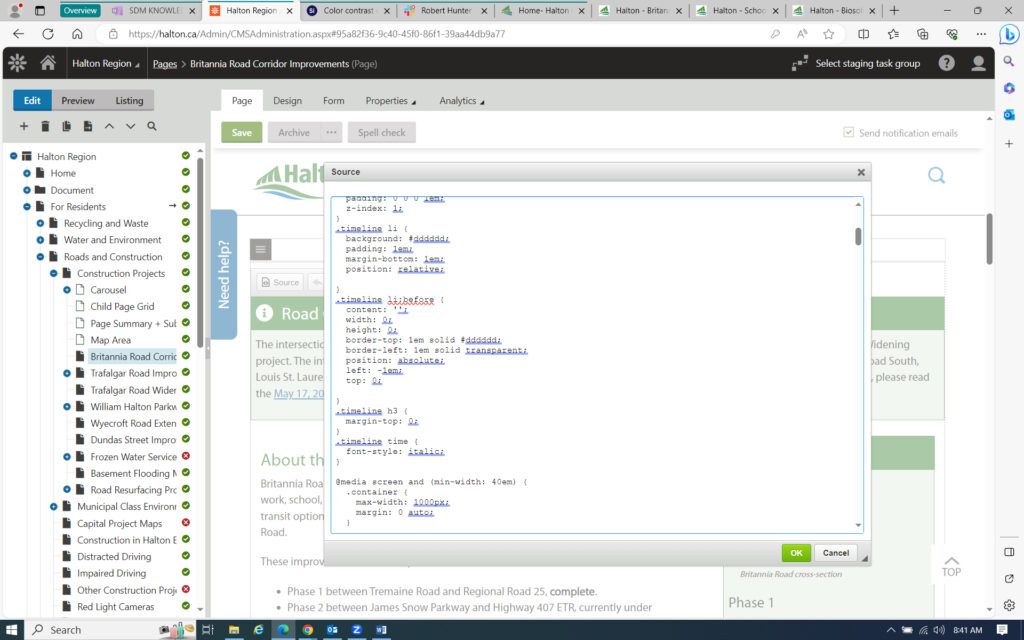
Here’s a web page within Kentico. The source code panel is displayed, providing the option for custom CSS code insertion. I strongly advise against embedding CSS directly into pages.
Conclusion & Key Takeaways
In just three months, the website’s accessibility saw remarkable improvement, a testament to the exceptional collaboration of the client team. The introduction of the Design System served as an all-encompassing solution to address the various challenges faced, including accessibility, dynamic stakeholder needs, business requirements, brand guidelines, and aesthetics.
A critical factor for success in this project was the ability to swiftly identify obstacles, seek assistance from appropriate channels, and prioritize actions within one’s control.
Next steps
To maximize return on investment, we highly recommend conducting a Contextual Observation. This will provide valuable insights into how the solution is utilized by various stakeholders, enabling us to identify areas for improvement.
